So far, we explored a Modern Living Room. I hope you enjoyed that post. This week we move on to the Kitchen….
The Modern Kitchen
I wanted to carry the color palette of the living room into the kitchen, so I continued with the
browns, blacks, grays and soft golds. Bon Appetit!
Cabinetry Selections
Cabinets, Countertop Material, Backsplash tile, Cabinetry Hardware
For the Kitchen cabinetry I wanted to choose a cabinet style that was stream-lined and clean.
Armstrong Cabinetry provides a great option. Their “Moderno” Collection offers just what I had in mind
The Toffee finish is not too light and not too dark and coordinates well with the other
pieces of our Kitchen puzzle. Now for the counter top material. After having Staron quartz
by Samsung (yes, the TV people!) installed in my own kitchen a couple years ago, choosing
counter tops was a no brainer! I LOVE my quartz! Ease of maintenance is what makes me love it most.
Quartz does not have all of the color and pattern, or “movement” that granite and some
other surfaces express. Our virtual modern kitchen needs the “quietness” the lack of pattern in the
quartz provides also stays within the parameters a modern space calls for.
of the Kitchen are understated I thought it would be fun and interesting to implement
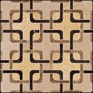
a backsplash material with some pizazz! The “Squareweave” pattern from the
Ann Sacks Mosaics collection gives us just enough color and pattern to both coordinate
and accentuate the overall feel of the space. 
Lastly, we need our hardware, which I often refer to as the “jewelry” of kitchen cabinetry. The hardware adds the finishing touch.
I wanted to make careful selection, as I wanted the hardware to compliment and not take away from all the other choices. Rocky
Mountain Hardware, as always, gave me much to choose from. I selected the Olympus Pull for the drawers and the Shift Knob for
the cabinets in the Silicon Bronze Light Finish. Too bad this isn’t a real world kitchen- I would LOVE to see all of this come together.
Plumbing Selections
Sink and Faucet
Sink selection often comes down to personal preference. I happen to prefer a cast iron sink. The Kohler Smart Divide
I chose for our virtual space is great. I also like the Almond color the sink comes in. The faucet, also by Kohler, has
nice lines and also a heftiness to it that exudes a look of quality and performance. Again, another nice fit into the
puzzle that is becoming our beautiful virtual Kitchen!
Flooring Selections
Flooring and Area Rug
In an effort to include items that are environmentally friendly I chose cork flooring for the kitchen. 
read about the many advantages of using cork for flooring applications). On an aesthetic level, I love the color of the cork and the
pattern it adds. To break up the pattern a bit, I chose the Stark Area Rug. I love the strie pattern (tight stripes) of the rug!
Furniture Selections
Dining Room Table, Dining Chairs, Bar Stools
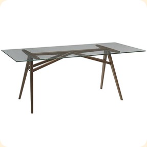
You may notice a sort of similarity to the furniture items I have selected. I wanted keep the pieces clean and sleek.
West Elm Dover Dining Table
West Elm Modern Windsor Dining Chair
West Elm Rustic Bar Stool
Lighting Selections
Mini Pendant (Island), Large Pendant (Dining Room Table)
I chose fixtures that would continue that look of sleek, trim and clean.
Murray Feiss Parker Place Mini Pendant
Troy Lighting Redmond 6 Light Pendant
Wall Color
Imagining that our floor plan is open and spacious, I wanted to carry the Living Room wall color into the Kitchen.
Adding a new color could introduce an element of fussiness that could take away from the space, rather than
accentuate what is there. I never want to add anything to space that can “jar” the eye or the senses!
Sherwin Williams- Buckram Binding
Fabrics
Okay, now to my favorite part….the FABRICS!! The fabrics add the icing on the cake to a space.
The Duralee floral that I selected is what I may call an updated floral, due to the scale of the pattern
and also the color combination. I really like this fabric. It also does a great job of coordinating all the
hues of the space. I would use this fabric on the window treatments. The Duralee stripe would be used
as seat cushions on our West Elm Bar Stools. I especially like the stitching of the fabric. It adds a needed
texture to the space.
Window Treatment Fabric
Bar Stool Cushion Fabric
So, how do you like it? I hope this shows that you can do modern but still have a warm, inviting environment.
I like to refer to these spaces as “Elegant Modern.” I also hope that as you read this blog and blogs to come that
you realize that every decision that is made in a space is one that matters and relates to something else.
The selections your designer makes are ones that have been thought through and all of those little details are what make all the difference!
Stay tuned for the next room! What will we tackle next? You will have to wait and see!!!


No comments:
Post a Comment